Logo and branding:
The primary brand colors we inherited – Orange
& Black. The colors featured across the brand’s website and other collaterals were largely Black and shades of Gray, with Orange highlights.
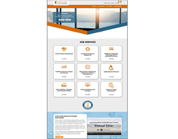
 One of our key objectives for initiating the brand identity refresh was to introduce a more varied color palette. Our primary colors changed to Navy and Orange as reflected in the new logo.
 As you can see from the redesigned logo, we discarded the Orange sphere, replacing it with a more contemporary looking graphic that melded our two primary colors together. Orange, symbolizing hope and optimism, and Navy to lend a sense of gravity and equanimity to the brand identity.
We also introduced a secondary color palette to inject more life & dynamism into the brand’s assets and collaterals – a much lighter shade, almost a Sky-Blue derived from the primary Navy color; and likewise, a much lighter shade, almost a Light Peach hue derived from the primary Orange color. This new color palette made a big difference in and of itself, but we were just getting started.
We then carried forward this newly created look and feel across a wide range of branding elements – the website, capabilities statements, stationery, collaterals, social media templates, infographics, and various other branded assets and platforms.


